Responsive design is one of the most important approaches in today’s digital environment. 52.99 % of global web traffic originated from mobile & other devices. So each web development process is based on a mobile-friendly approach.
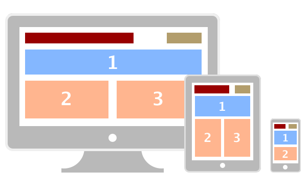
Nowadays almost every website owner needs a mobile version of their web product. The screen resolutions of different devices must be compatible with your website, no matter who is viewing the website. In addition, the optimized responsive images and content of the website will:
- turn your online visitors into buyers.
- keep the visitors on your website by decreasing the bounce rate
- maximize the conversion rate
ADVANTAGES OF RESPONSIVE WEBSITE DESIGN
The benefits of having a responsive website are:
- Super flexible screen resolution and layouts
- Progressive website navigation
- A low percentage of bounce rate
- High visibility in search engines
- Excellent User Experience etc.
Let’s see the changes of responsive design on the example of Time Magazine:

RESPONSIVE DESIGN IS RECOMMENDED BY GOOGLE
Since June 2012 Google officially recommended smartphone-optimized websites. The following is Google’s recommended configuration:
Sites that serve all devices on the same set of URLs, with each URL serving the same HTML to all devices and using just CSS to change how the page is rendered on the device.

WHY GOOGLE PREFERS RESPONSIVE DESIGN:
However, why responsive design makes Google so happy. Let’s see the reasons:
If your website only has one URL for each page, then the website, with responsive solution attract more links to the main pages
For example,
- Mobile – http://m.domain.com
- Desktop -http://domain.com
It is easier to share a website if it is responsive
Responsive sites can be indexed
We wouldn’t need to crawl a page with the different Googlebot user agents
to retrieve and index all the content.
Readers enjoy visiting responsive websites, they look better and work on different devices
In addition, Google’s main goal is to satisfy user queries.
SEO & RESPONSIVE DESIGN
The websites with responsive design help search engines easily index and crawl it. Let’s see the other benefits:
- Usability
Each responsive website is preferable for readers and of course, it boosts website engagement and user experience. Also, it will bring your visitors back to your website. Mobile-friendly is one of the factors for Google ranking algorithm.
- Faster Load Time
The page load speed is another ranking factor for Google. Responsive design of website decreases the time of redirections from queries to the URL. There are a lot of online tools which you can use to test the load time of the website:
- Link Building
One of the main tasks of SEO is building backlinks from trustworthy sites. So, when you move your website to the responsive design you can be sure that all the backlinks will be kept.
- Low % of Bounce Rate
In general, websites get high bounce rate when the content is un-relevant for users, but having responsive design it will have to get your targeted audience.
RESPONSIVE DESIGN TESTING TOOLS
We collected a list of FREE online tools that will test the responsiveness of your website, let’s start:
- Mobile-Friendly Test – Google Search Console
- Material Design
- Media Genesis
- Responsinator
- CSSChopper
- ScreenFLY
- Am I Responsive?
- PixelTunner
SOME INTERESTING FACTS
- The number of mobile users is increasing, so the 1,08 billion users of 4,4 billion are SmartPhone Owners.
- 13% of global traffic originated from mobile
- 48% searches are performed on mobile devices
- 53% Of Emails are opened Via Mobile Devices
- 67 % of users prefer responsive website when buying services or products. Otherwise, they quite a webpage
- 83% of the #1 place in the search results are mobile-friendly websites
- 81% of the top 3 places in the search results are mobile-friendly websites
- 77% of search results on page one are mobile-friendly.
HOW CAN WE HELP YOU
Our company has a professional team of experienced engineers, who design responsive websites and guarantee that it will have outstanding UI/UX adaptability in different devices. In addition, a responsive solution of your web product will help you to win more clients.
Hence, the number of mobile users is increasing, we provide digital solutions that will make your website responsive to every device. We offer:
- Website analysis
- Responsive design compatible with browsers like Chrome, Mozilla Firefox, Safari, Internet Explorer 9, Opera and Android browsers
- Designing any custom resolutions 240px X 320px, 320px X 480px, 480px X 768px and 768px X 1000px and above.
- Improving load time and providing faster solutions f
- Mobile compatibility with faster load times
- Creating a dynamic version of the website for mobile & desktop
- User-friendly responsive websites
- Get better conversion rates
- Get the maximum ROI
In brief, you can lose a potential customer if your website has a problem accessing from mobile devices. Choosing our company as a reliable partner for responsive web design services, you can enjoy your mobile-friendly website.
REQUEST RESPONSIVE WEBSITE SERVICE
In conclusion, the benefits of responsive design are multiple. High-quality digital solutions like Responsive Design, Inbound Marketing or SEO can push your company’s success far beyond the competitors.
If you’re ready to take the next step with our professional team, please fill out the request form here. Check the services you are interested in and we’ll review your quote immediately!